Showing posts with label CSS3 HTML5. Show all posts
Showing posts with label CSS3 HTML5. Show all posts
Friday, May 18, 2012
Text-Shadow Exposed: Make cool and clever text effects with css text-shadow ¦ kremalicious

The aim of this article is to give you a quick introduction of a css property named text-shadow which was first included in CSS2 (but it’s not implemented in all browsers yet). Nevertheless you can make some cool effects with it, which could only be done before by photoshopping text and rendering it as an image.
Because it’s included in Safari since version 1.1(!) Mac users should be aware of various effects done by this property. In fact, most companys and persons with mac users as their main target audience use this effect on their websites.
This article describes how text-shadow works, what you can do with it and which browsers currently support it. At the end of this article I’ve made up some examples and provide a list of useful resources.
Using CSS Text-Shadow to Create Cool Text Effects
Using CSS Text-Shadow to Create Cool Text Effects

The CSS3 text-shadow property has been around for some time now and is commonly used to recreate Photoshop’s Drop Shadow type shading to add subtle shadows which help add depth, dimension and to lift an element from the page. This isn’t all the text-shadow property is capable of though, by getting creative and playing around with the colours, offset and blurring we can create some clever and pretty cool text effects!
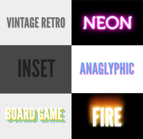
Check out the six text effects of vintage/retro, inset, anaglyphic, fire and board game in the demo, then copy the code snippets below to use the effects in your own designs. Needless to say you’ll need a text-shadow supporting browser (Safari, Chrome, Firefox) to see them in all their glory.

